A two-tone kitchen is one of the most common things people ask me for, and it's easy to see why: a bit of contrast makes a space feel considered rather than flat. The trouble is that the difference between a kitchen that looks designed and one that looks like a mistake usually comes down to a few simple decisions. After building and installing kitchens across Gisborne for years, here's how I think about getting the balance right.
What "two-tone" actually means
Two-tone just means using two cabinet colours or finishes in the same kitchen instead of one. Most often that's a darker shade on the lower cabinets and a lighter shade on the uppers, but it can also be a contrasting island, a different finish on a pantry run, or timber paired with a painted colour.
The reason it works is grounding. A heavier colour down low and a lighter one up high mirrors how we naturally read a room, so the kitchen feels stable. Flip that, with dark uppers over pale lowers, and a lot of kitchens start to feel top-heavy and a little cramped, which matters in the smaller footprints common in older Gisborne villas and bungalows.
Which cabinets get which colour
Here's the approach I use with most clients:
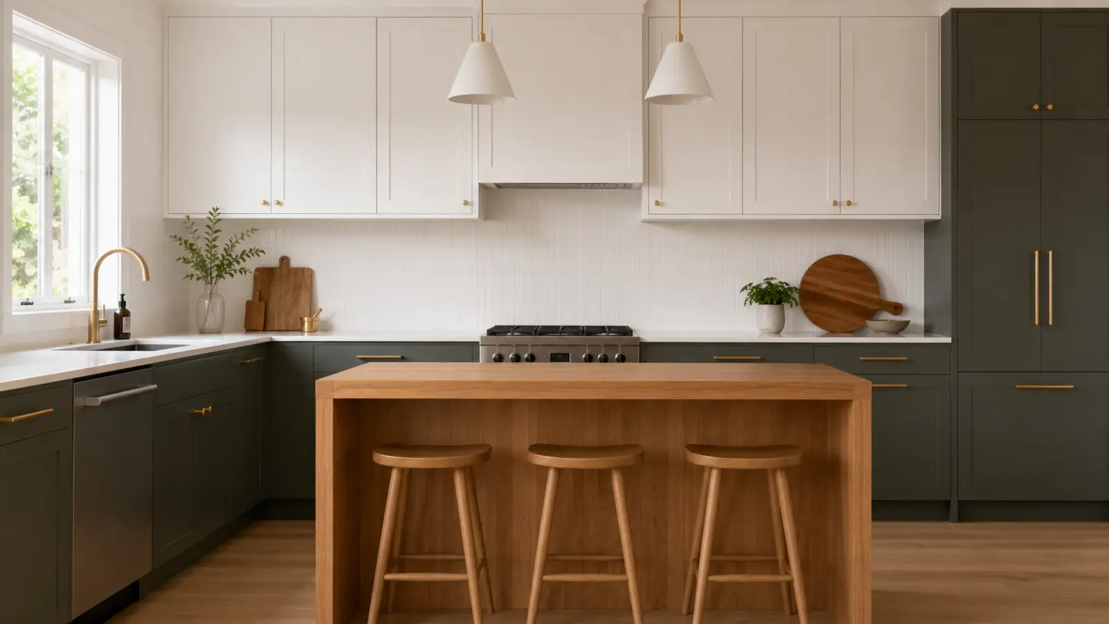
- Lowers darker, uppers lighter is the safe, timeless default. Think a charcoal, deep navy or warm green base with an off-white or soft grey above.
- Island as the feature is my favourite for open-plan homes. Keep the perimeter cabinets one quiet colour and let the island carry the bolder tone or a timber finish. It draws the eye to the heart of the kitchen.
- Tall units in the lighter colour keeps a wall of pantry and oven cabinetry from feeling like a dark slab. If your tall run is on the darker tone, make sure there's enough light nearby.
- Timber as one of your two tones is a great fit here. A bit of oak or a warm-stained ply on an island or open shelving softens everything and ages beautifully.
If you only remember one thing: put the heavier colour down low and let it ground the room. Everything else is easier from there.
Proportions and where the line sits
Balance is really about how much of each colour you use. A roughly two-thirds to one-third split tends to read better than a straight fifty-fifty, which can look indecisive. Pick a dominant colour for most of the room and let the second tone play a supporting role on the island or a single run.
Be deliberate about where the colours change. The cleanest result comes when the benchtop creates a natural break between your lower and upper colours, so the eye has a horizontal line to rest on. Avoid splitting colours partway along a single unbroken run of cabinets at floor level, it tends to look accidental rather than intentional.
How much contrast is too much
Contrast is a dial, not a switch. High contrast, like near-black against crisp white, is striking but demanding: it shows every fingerprint, every crumb, and it dates faster because it reads as a strong statement. Lower contrast, two tones that sit closer together, is calmer and far more forgiving day to day.
For most Gisborne homes I steer people toward medium contrast. You still get the depth and interest of two tones, but the kitchen won't shout at you in five years' time. A practical test: look at your two samples together in your own kitchen, in daylight and under your evening lights. Our coastal light is bright and a bit warm, and a colour that looked perfect in a showroom can shift noticeably once it's on your walls.
Keeping it timeless
Trends move quickly, and replacing cabinetry is not a small job, so I always design with longevity in mind. A few honest pointers:
- Anchor it with neutrals. Let one of your two tones be a quiet, lasting colour and save the personality for the second.
- Spend your contrast budget on cabinets, not everything. Keep benchtops, splashbacks and flooring relatively calm so the two-tone cabinetry stays the star.
- Match the metals. Handles and tapware in a consistent finish pull the two colours together.
- Think about resale. Bold, very specific colour pairings can narrow your buyer pool down the track.
On cost, two-tone usually adds a little over a single-colour kitchen, mostly in setup and finishing for the extra colour, but it's a modest difference rather than a dramatic one. It's worth asking for a clear breakdown so you know what you're paying for.
Because we design, build and install in-house here, we can show you real door samples in your own light before anything is locked in, and every kitchen we make is backed by our 5-year workmanship warranty. If you're weighing up a two-tone scheme, take your time with the samples at home, that's where the right balance becomes obvious.
Sukhman Singh
Founder & Cabinet Maker, Flow Joinery
Sukhman designs and builds bespoke kitchens, wardrobes and cabinetry across Gisborne. Read more →
Reviews
No reviews yet — be the first to share your thoughts.
Sign in or create an account to leave a review.